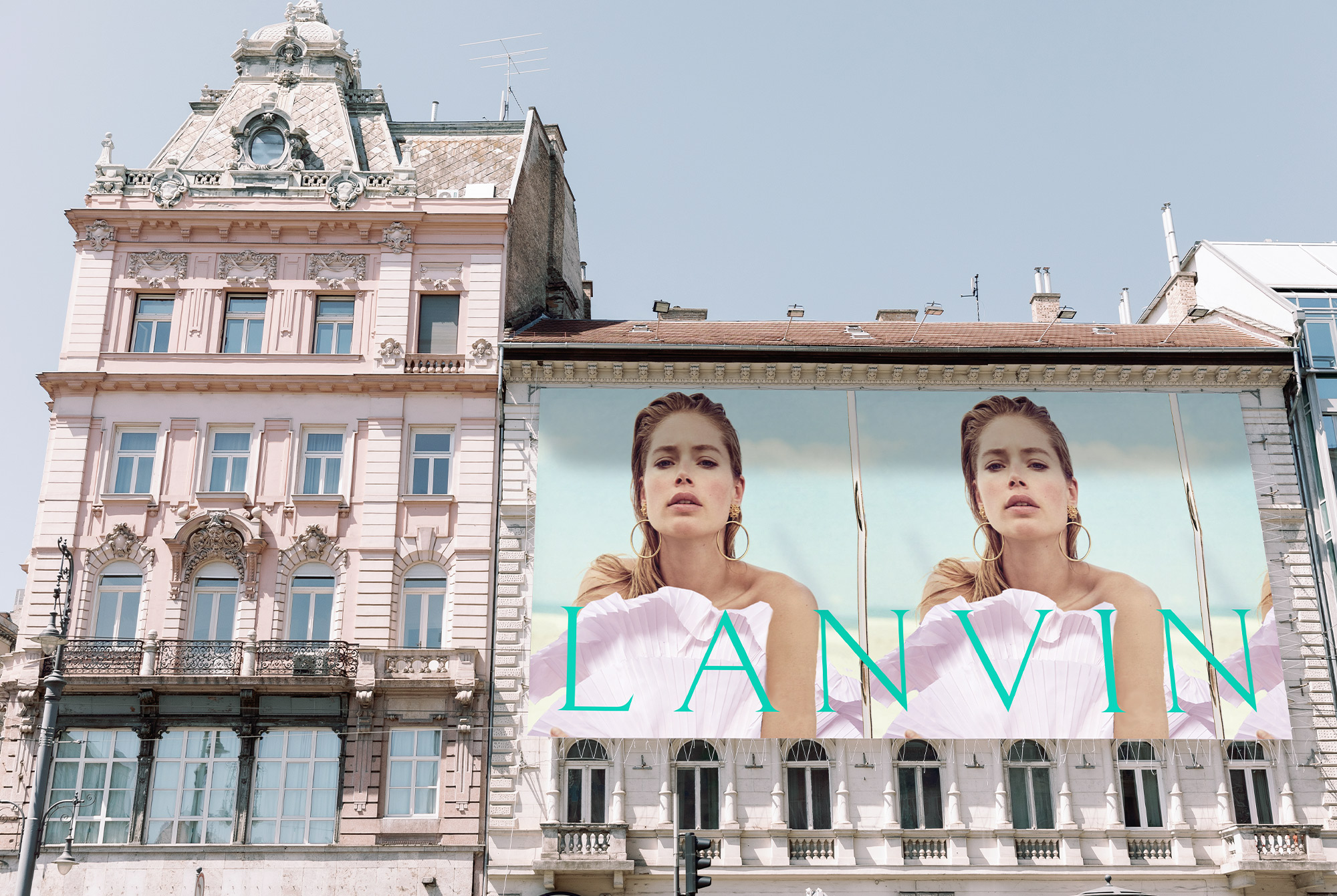
Lanvin’s reimagined brand identity system and strategy takes its cues from the origin story of the heritage house– A love story between a mother and daughter. At its core, the new direction embraces the idea that a mother’s love and femininity embody the very essence of Mother Nature’s nurturing touch. With nature as the new symbolic archetype of the brand, the concept aims to capture this synergy, fostering an aim to direct the brand into a more sustainable and circular business model that harmonises with the environment.
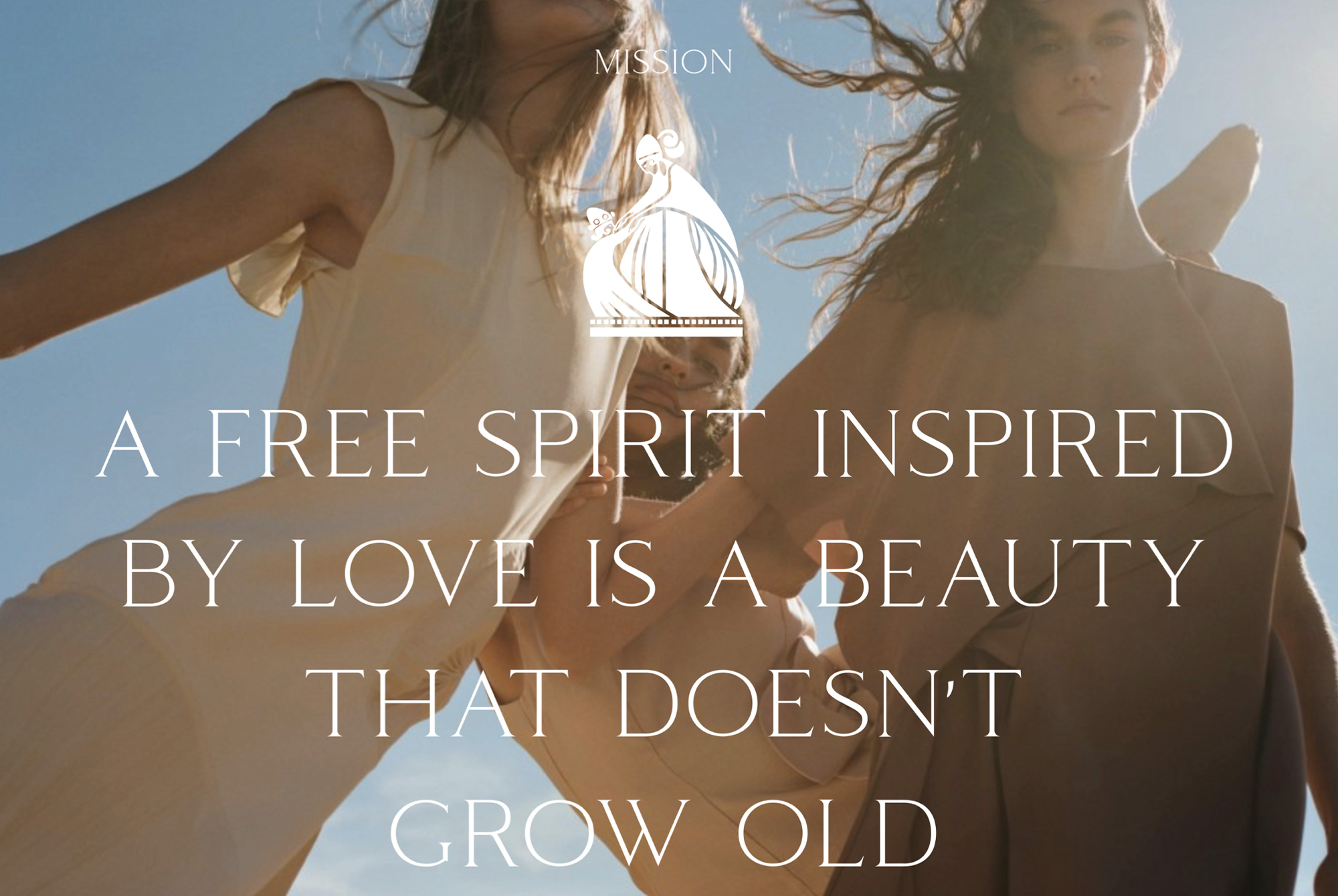
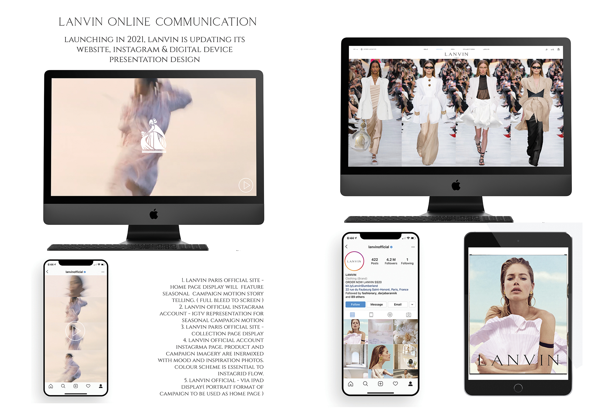
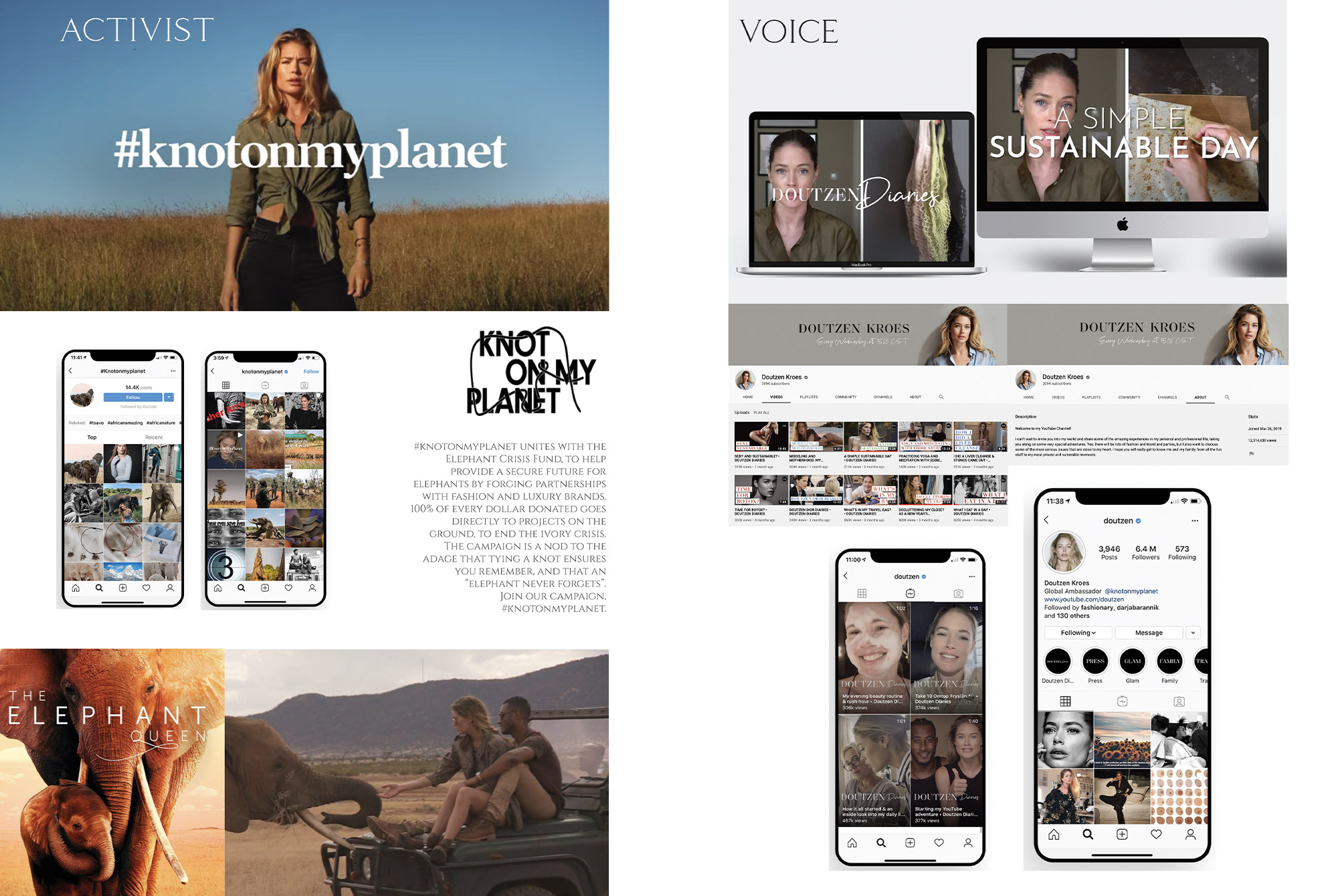
Lanvin’s communication strategy revolves around storytelling, embracing the narrative of the mother-daughter love story and the brand’s commitment to sustainability. Through captivating campaigns and social media initiatives, Lanvin shares heartfelt tales of shared moments, celebrating the strength, resilience, and grace passed down from one generation to the next. Collaborations with environmentally conscious media personalities, artisans and creatives further emphasise the brand’s dedication to a green future.
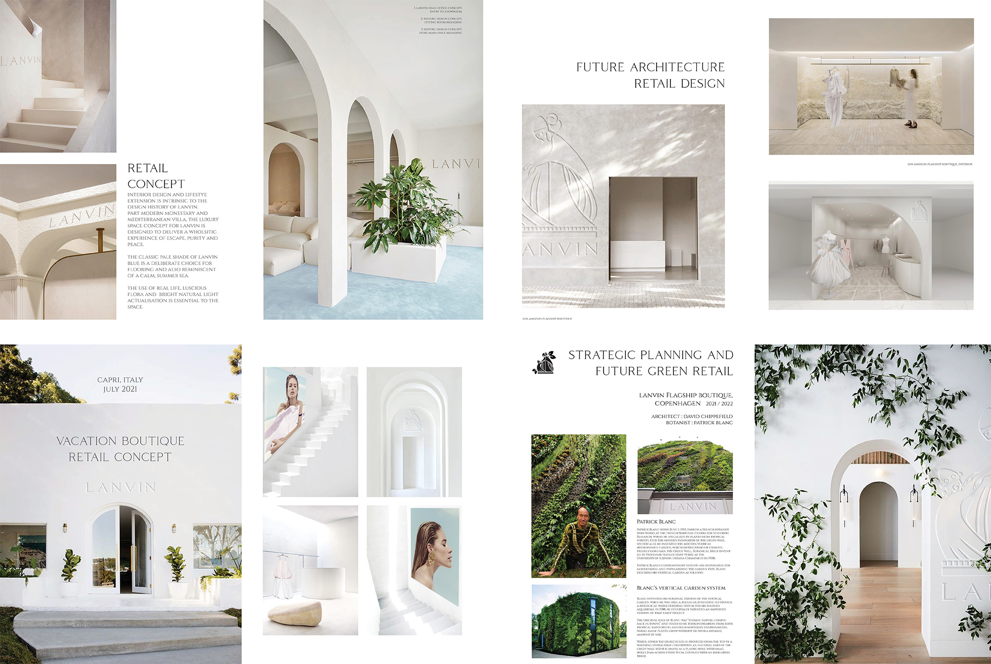
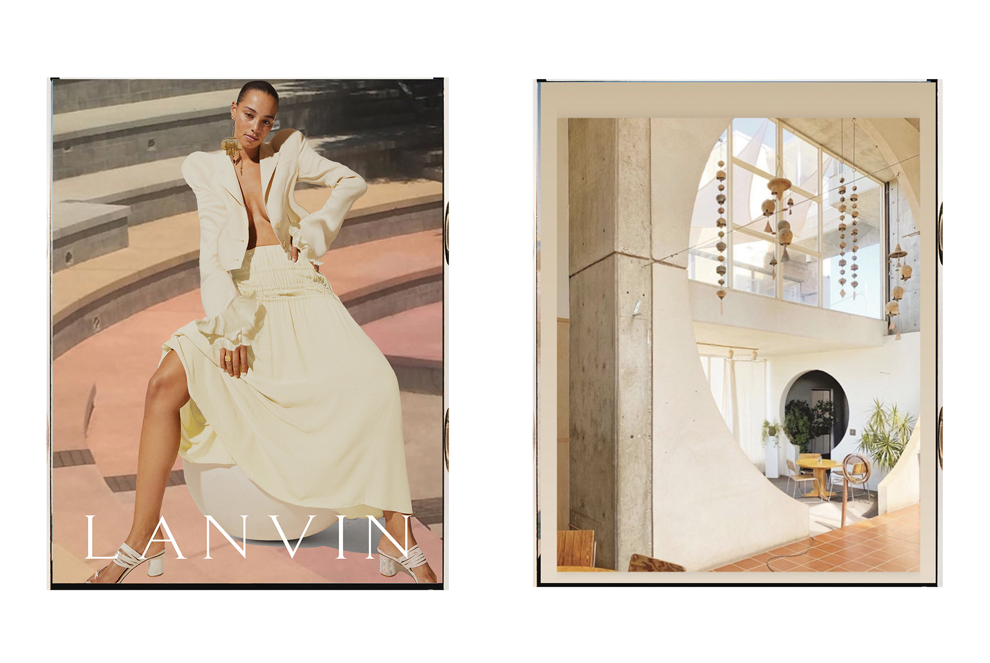
In physical spaces, Lanvin boutiques become serene sanctuaries of beauty, blending the elegance of heritage with the serenity of nature. Sustainable materials, lush greenery, and eco-friendly design elements harmoniously intertwine to create an immersive experience that resonates with the brand’s new ethos. Each store becomes a nurturing haven, inviting visitors to embrace the natural world and celebrate the timeless connection between femininity and nature.
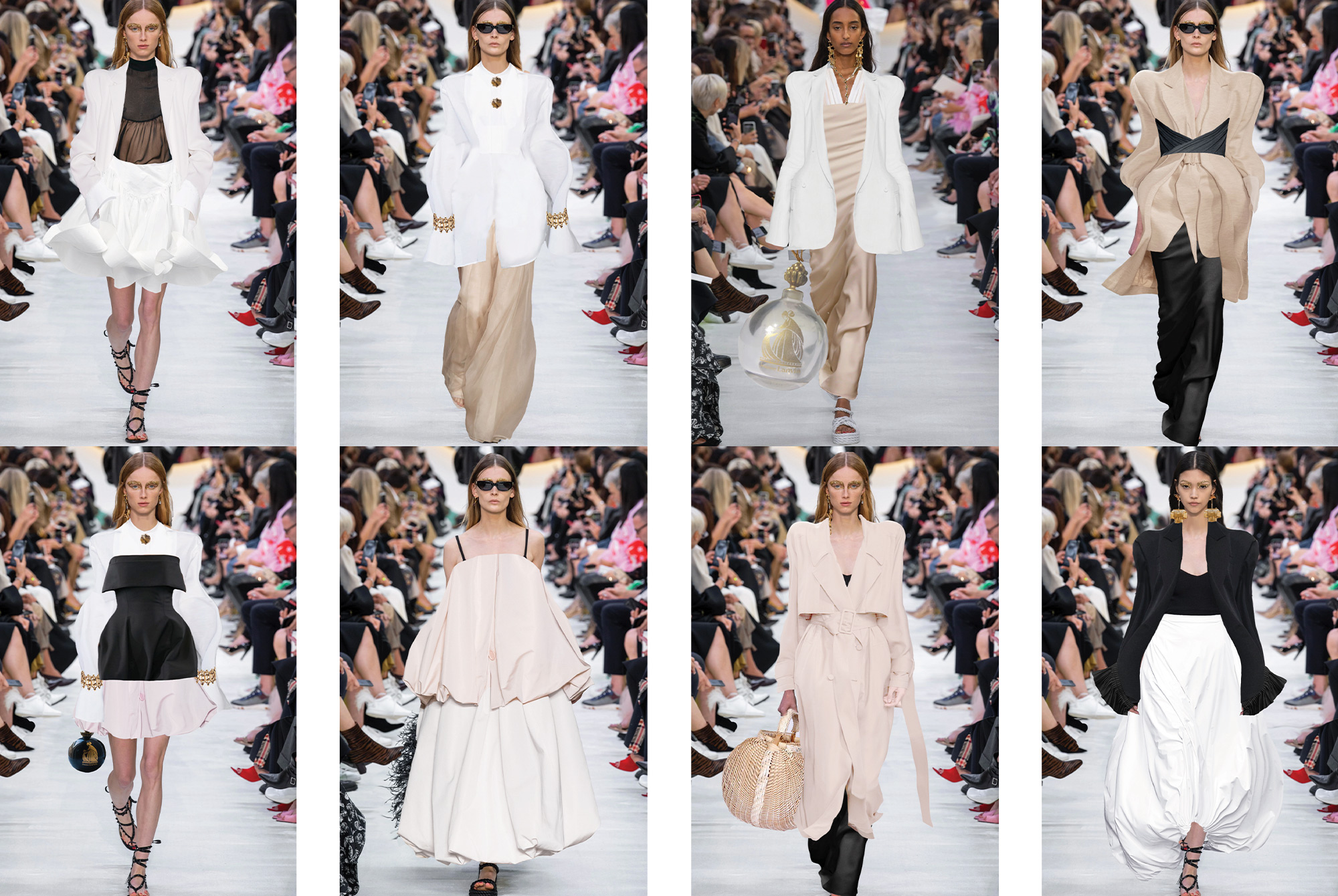
Visual Identity
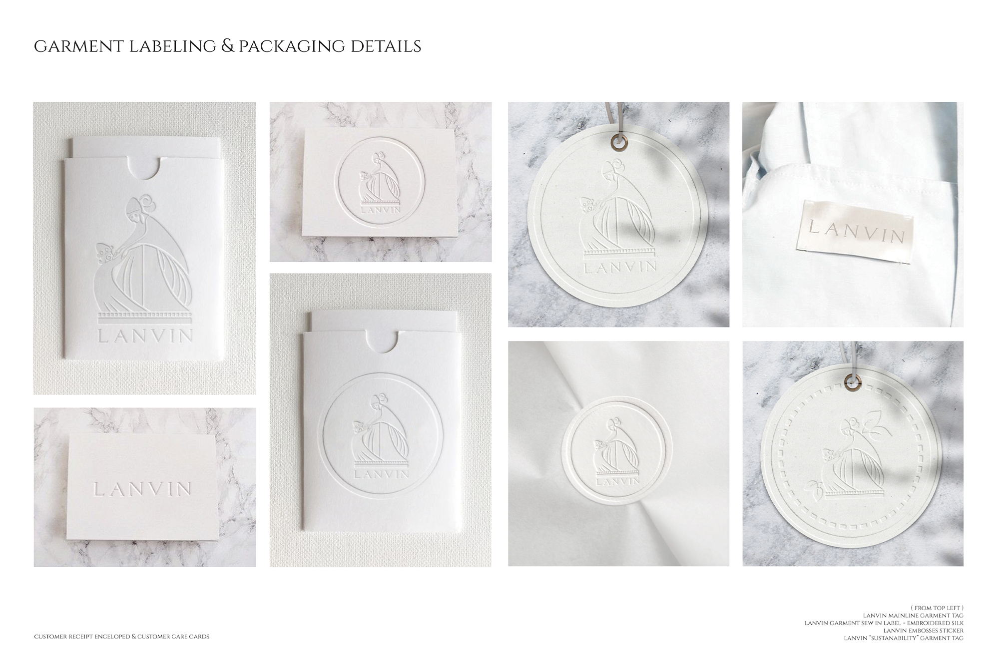
The brand’s added visual identity is an artistic portrayal of the tender connection between mother’s love and its new found attention to sustainability. The ‘Special Edition’ sustainability logo features the classic Lanvin emblem symbolising a mother’s embrace in a dance, adorned with subtle depictions of leaves and blossoms.
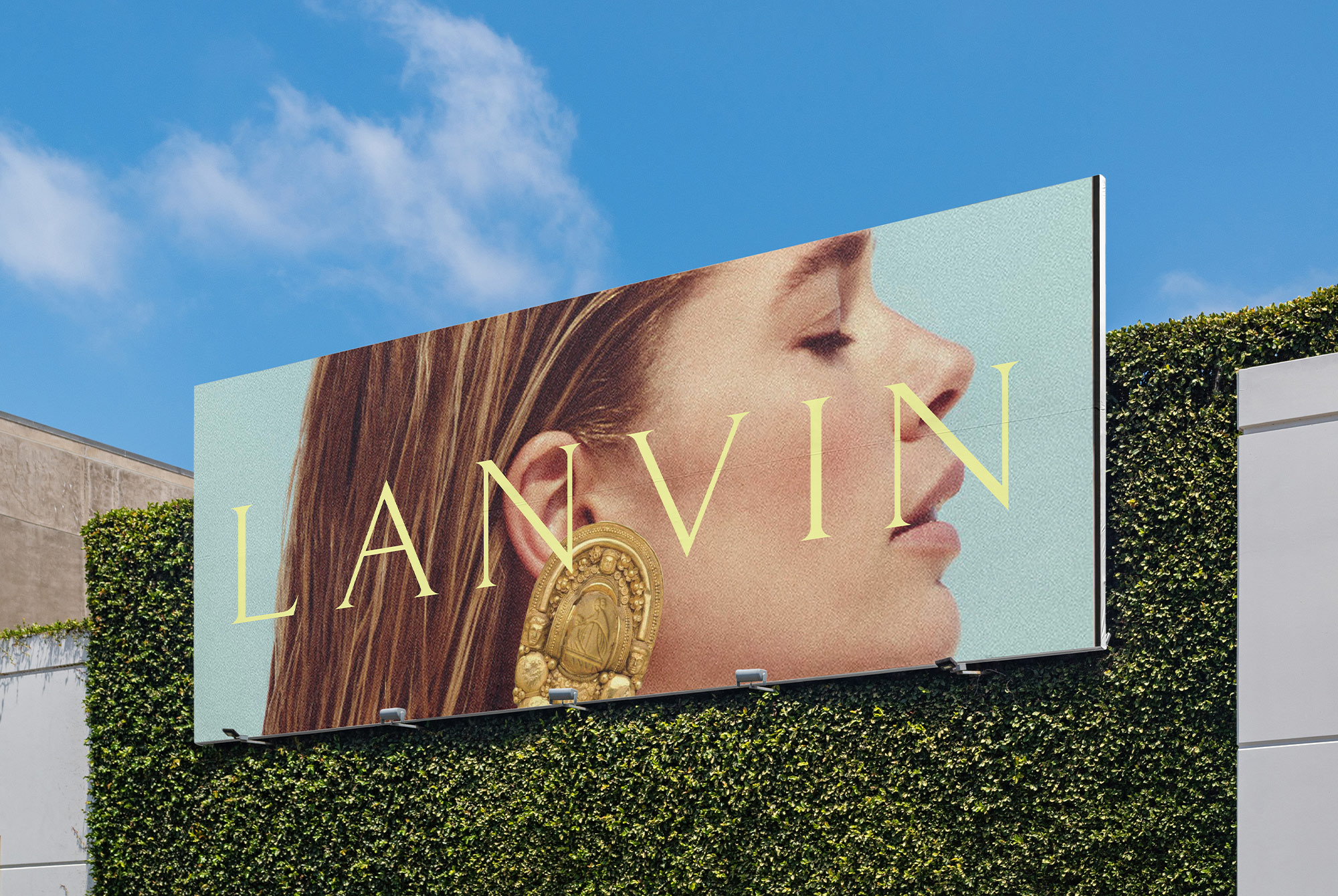
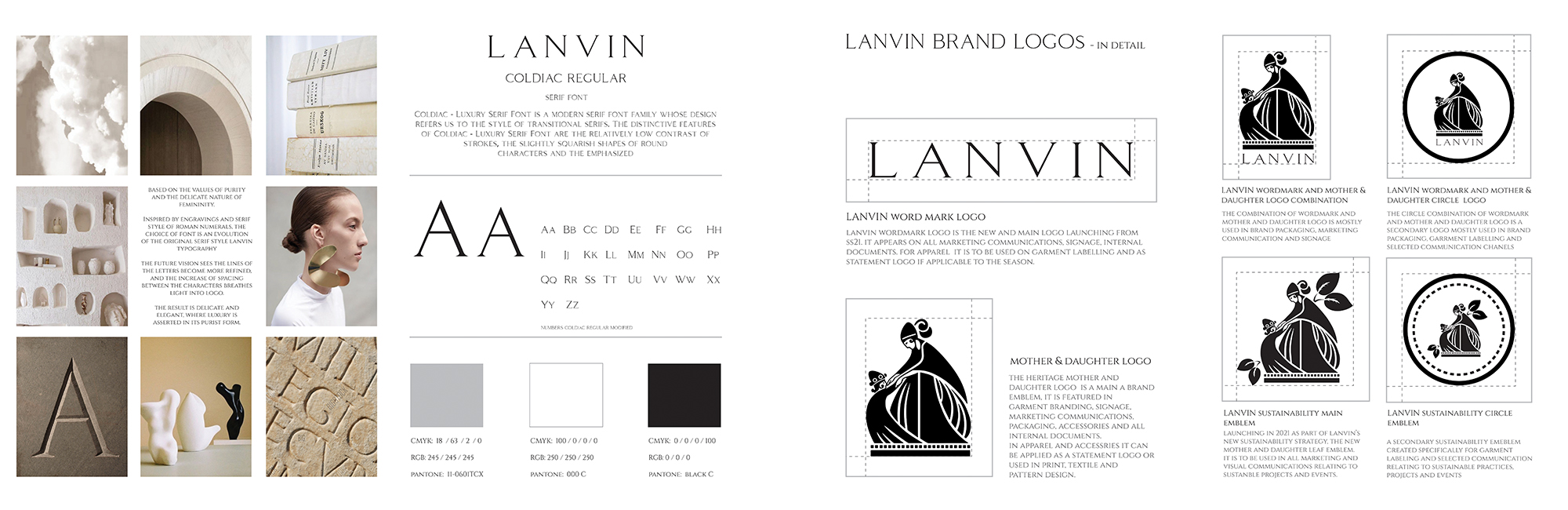
The choice of using a Coldiac as the new typeface for Lanvin looks at the new brand values of Purity, Emotion and Femininity. The conscious choice of kerning breathes fresh air to reflect purity, the refined lines of Coldiac Serif reflect femininity and emotion while the vertical scale reduction creates balance and harmony synonymous with nature